Geniune connections on dating apps

Compatibility

sb creative lab Designathon

2nd place

ROLE

UI/UX Designer

people

Selena Zeng, Julie Broch, Elyse Denzler
YEAR

2023

Weather app image
Weather app image
Weather app image
Weather app image
Weather app image
Weather app image

Introduction

Introduction

Introduction

53% of current college students say that they're lonely. With how busy the average student is, the importance of forming authentic connections without being emotionally drained grows higher and higher. 

Prompt: Reflect on the apps used for making connections -- whether it is platonic, romantic, or professional! Analyze your chosen app for any areas of improvement and design a prototype that implements a new feature. This feature should promote relationship-building.

Timeline

One weekend to solve the design challenge and product deliverables.

UX Research / Brainstorming

UX Research / Brainstorming

UX Research / Brainstorming

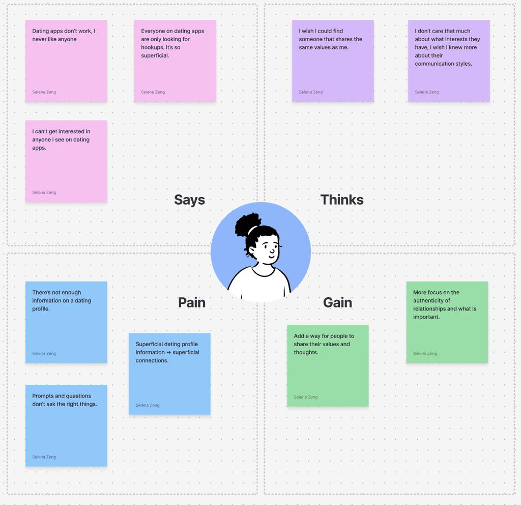
Given only 72 hours, we had to limit our research to personal brainstorming and user interviews. This is what we gathered:

1. It is difficult to connect with people online. 
2. In a partner, people wanted someone who shared the same values. 
3. Dating apps are too superficial these days, and are only used for hookups. 
4. Most people were looking for authentic connections.
5. Dating profiles aren't enough to decipher if someone would be a good match.

Using this, we created an empathy map to group together these ideas, and look at the app from a general user's point of view.

Solution

Solution

Solution

We wanted to focus on addressing the difficulty of finding true connections through dating apps by matching people off of the values that they believe in, allowing them to find their Compatibility. 

Daily Questions

To gather information on important values.

Compatible Filter

Can be applied to a user's feed of dating profiles to filter out matches with matching values.

Point of Agreement

Section on dating profiles to help users gauge how compatible they are with others.

We first started with a user flow diagram to map our a user's potential movement through the new feature. 

  • daily questions

    When the user enters the app for the first time of the day, they have to answer four Questions of the Day before continuing, making sure users are updating their values. 

    Users can choose how much they agree or disagree with the statement and also to add comments where they can elaborate on their choice. This will be used later.

    Weather app image
  • compatibility filter

    After answering the Questions of the Day, the user is able to see all their feed of dating profiles.

    By clicking on the "Compatible" filter, users are able to filter out their feed so that it only shows those with 50% or higher Compatibility!


    Weather app image
  • point of agreement

    As the user scrolls down on the profile, they can find out more information about their compatibility percentage. 

    Their Point of Agreement is displayed, which is their most similar value. Comments about the value are also displayed.


    Weather app image

Reflection

Reflection

Reflection

I learned a lot from this project! Since we only had 72 hours to develop it, it was important that we had to limit our design process to what was important. Therefore, we unfortunately could not make moodboards, branding guidelines, or send out a survey to gather more user information. It was also difficult to improve an app that I had never used before, which was why creating the empathy map to understand a general user was so important. 

I'm glad that me and my team were able to improve our Figma technical skills and problem-solving skills.

Let's connect!

Navigation

Case studies

Spotify Redesign

CSU Website

Compatibility

Come on Barbie, Let's go Rush!

Let's connect!

Navigation

Case studies

Spotify Redesign

CSU Website

Compatibility

Come on Barbie, Let's go Rush!

Let's connect!

Navigation

Case studies

Spotify Redesign

CSU Website

Compatibility

Come on Barbie, Let's go Rush!