Bridging generations, one slang at a time
SlangSense
Team
Selena Zeng, Nilay Kundu, Piyush Jadhav, Ved Patil, Wyatt Hamabe
Role
UX/UI Designer, UX Researcher
YEAR
2025


Problem Statement
With a rise in social media among the younger generations, a surge of new lingo and slang has developed in modern language. Since much of the jargon is specific to technology usage, there is a barrier in the communication between the youth and the older generation as they struggle to navigate modern technology.
Technology Adoption
Older generations may struggle to adapt to digital communication platforms where slang and abbreviations are prevalent (e.g., memes, emojis, acronyms like "TL;DR"/”otw”).
Cultural References
Youth language often incorporates pop culture, social media trends, or niche internet phenomena, which older generations may not recognize.
Tone and Perception
The informality of youth slang can sometimes be interpreted by older generations as disrespectful or dismissive. There are underlying connotations beyond what is literally said.
Connection
The older and younger generations will be able to further understand each other, leading to a smaller generational gap.
Next, we used scenarios to imagine how a real user would interact with the product in a specific situation, so we could design with their goals and context in mind.
Scenario 1:
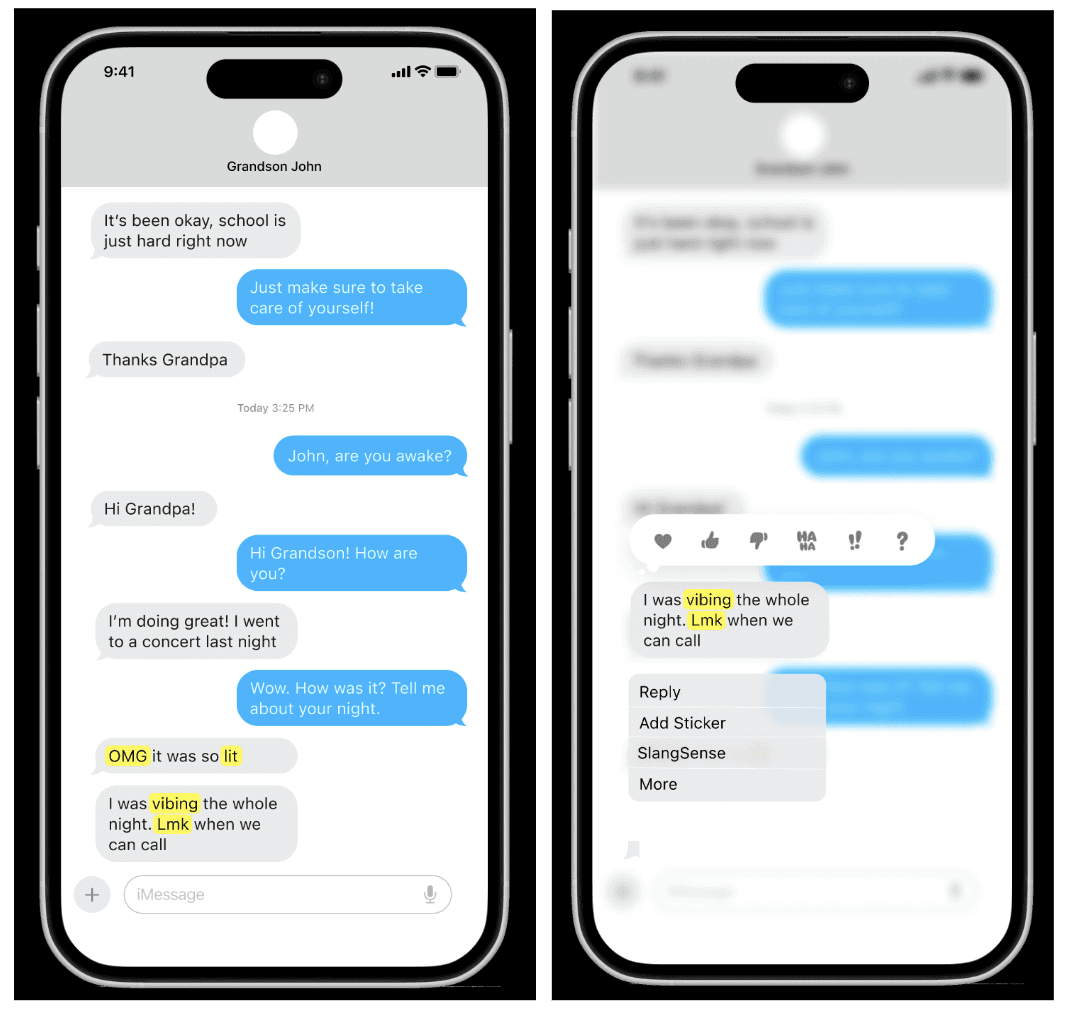
Dual Functionality: SlangSense works seamlessly as both an iMessage extension and a standalone app.
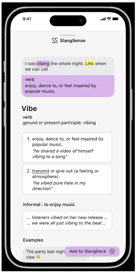
Instant Translation: Long-press a message, tap “SlangSense,” and get quick definitions for any slang word.
Deeper Understanding: Swipe up for examples, cultural context, and audio pronunciation.
Personal Slang Deck: Save terms to a custom deck for review and practice through interactive quizzes.

Scenario 2:
Easy Onboarding: Users sign up, then sync contacts or add people manually.
Choose a Role: Select whether to learn or teach slang.
For Learners: Access personalized flashcards from family or a shared slang deck.
Teaching: Create and share flashcards to support family learning.
We used storyboarding to visually map out a user's experience step-by-step, helping us better understand their journey and identify key moments to improve the design.
Storyboard 1
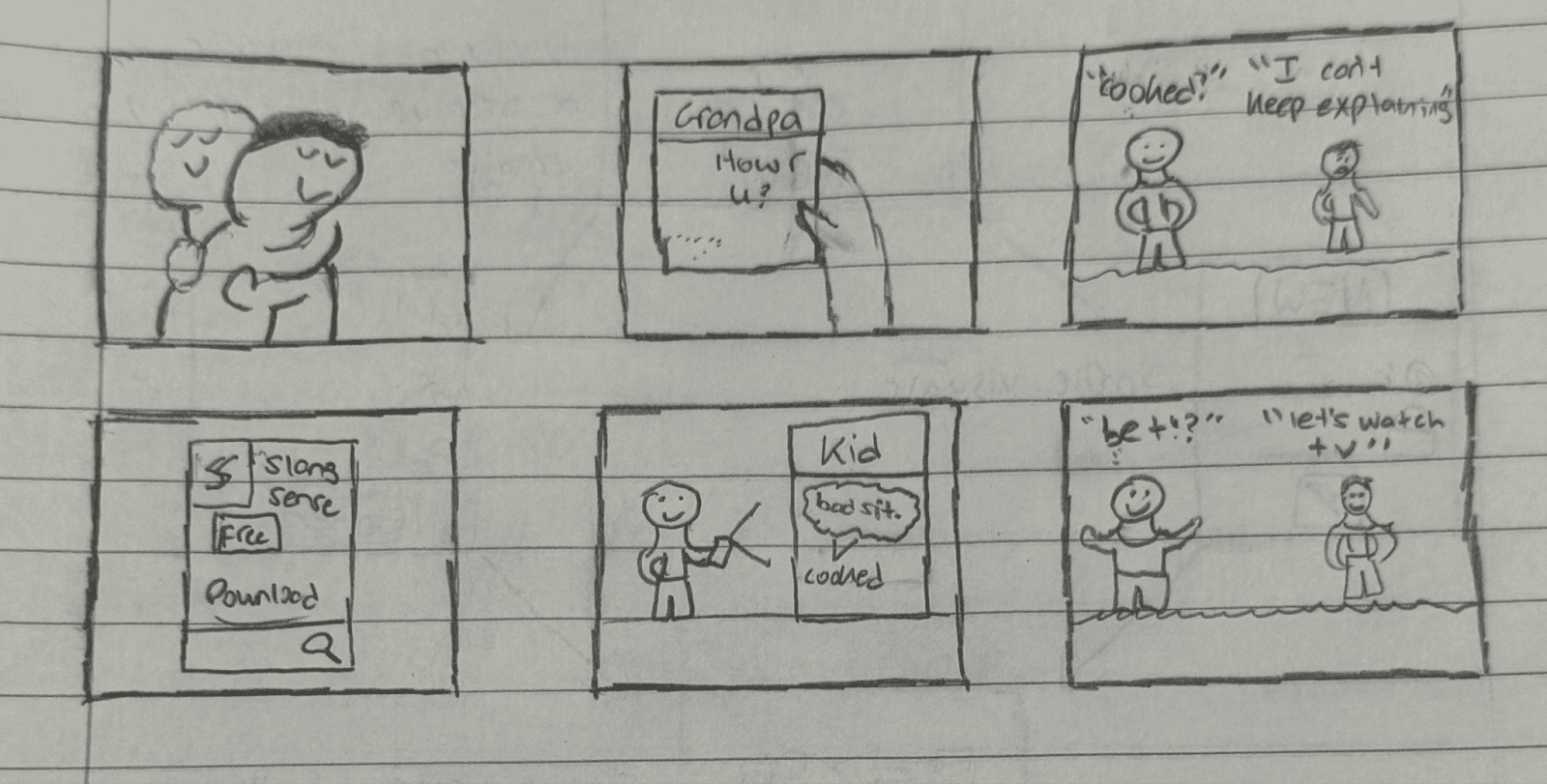
Liam (17) and his grandpa George (75) are close, especially after George lost his wife.
Liam texts often to keep him company, but slang causes confusion.
George struggles to understand, making conversations slow and unclear.
Liam finds SlangSense and installs it for both of them.
When Liam texts “cooked,” George taps it to see the definition instantly.
Their chats improve—and George’s “bet” reply makes Liam laugh.
Storyboard 2
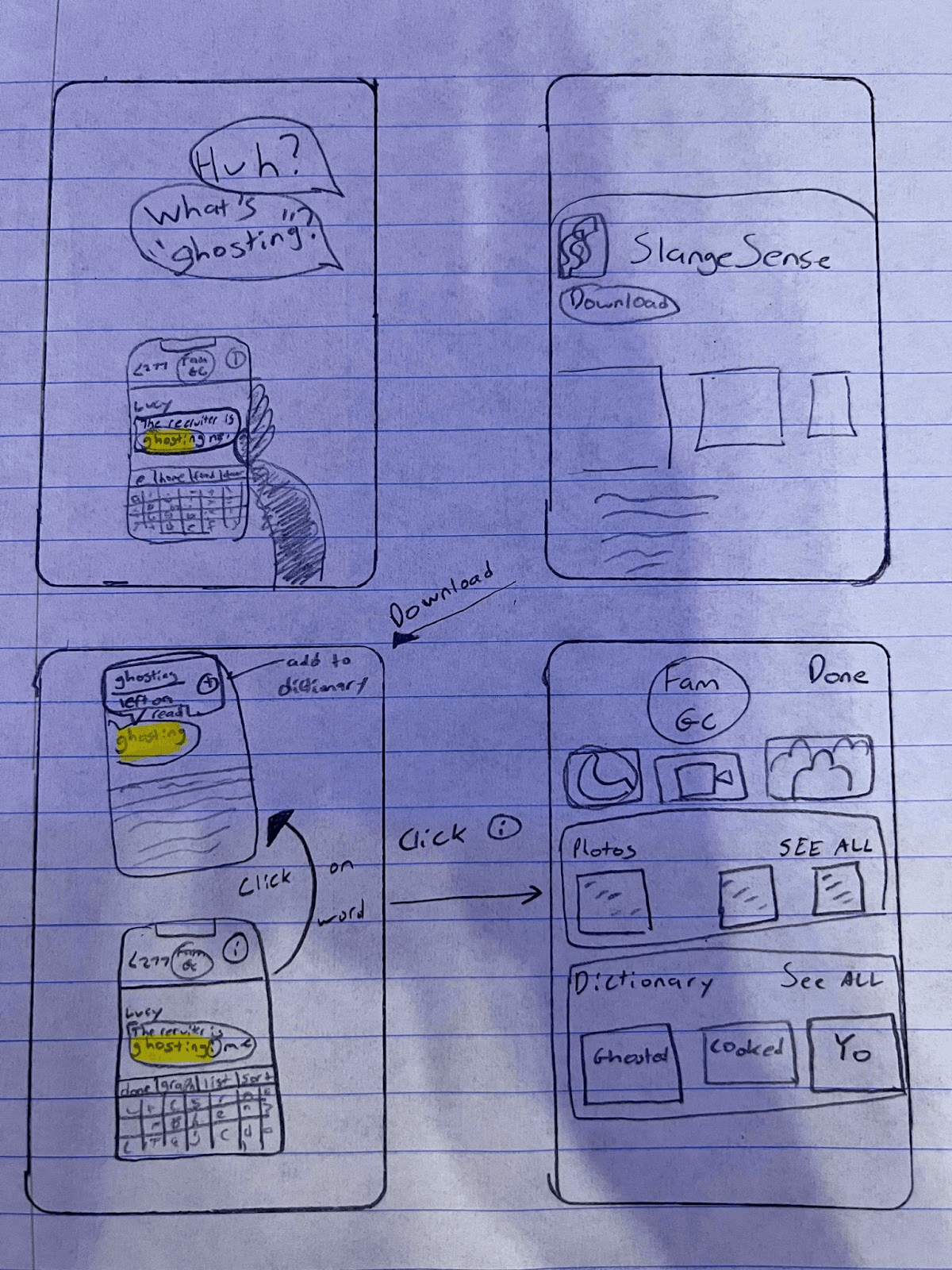

Margaret scrolls through the family chat, confused by slang and feeling left out.
Determined to connect, she downloads SlangSense and quickly sets it up in iMessage.
Slang like “ghosted” is highlighted—she taps to see the definition and saves it.
In the chat info, she reviews saved terms, with gold stars for family favorites.
Using flashcards, she swipes through definitions, pronunciations, and examples.
A week later, she confidently texts, “Pull up to my house for Thanksgiving 😊,” delighting her grandkids.
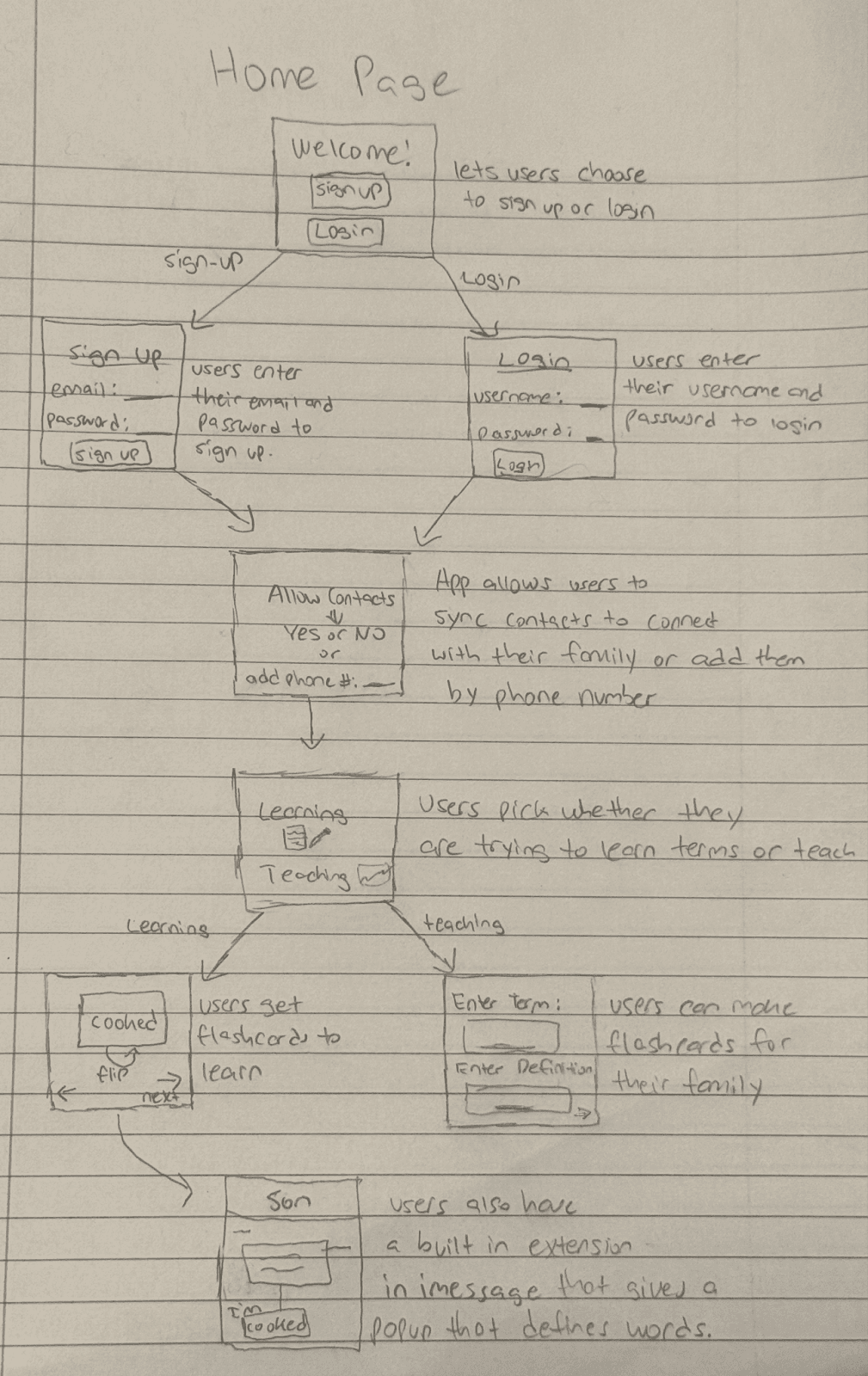
Low-Fidelity Wireframes
Through scenarios and storyboards, we identified the five key tasks that a user needs to complete in order to reach their goal. We focused on attacking these in our low fidelity wireframes.
Tasks
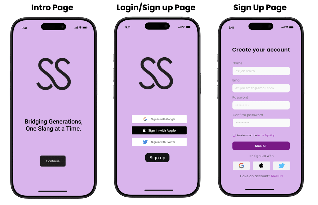
Login with google, apple id, phone number + add extension to iMessage (IN APP)
Highlight slang in text messages and open definition (EXTERNAL TEXT APP)
App navigation + Create subsets: home screen + create subsets for terms (IN APP)
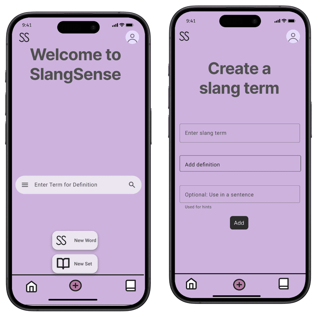
Create custom definition/slang term + add to dictionary (IN APP)
Dictionaries: View items in dict + Flashcard feature / Learning feature (IN APP)
Task 1: Login and add iMessage Extension
Usability Analysis
Learnability (Negative):
Multiple sign-up options (Apple, Google, Twitter, manual) may overwhelm new users.
Settings menu could be confusing on first use.
Efficiency (Negative)
Errors (e.g. incorrect info) require users to redo steps.
Safety — Error Handling (Negative)
No password guidelines shown during account creation, reducing security.


Task 2: Highlight slang in texts and open definition
Usability Analysis
Learnability (Negative):
Older users may not recognize interactive elements.
No onboarding/tutorial may cause a steeper learning curve for first-time users.
Efficiency (Negative):
Swiping for extended definitions may be less discoverable.
Safety — Error Handling (Negative):
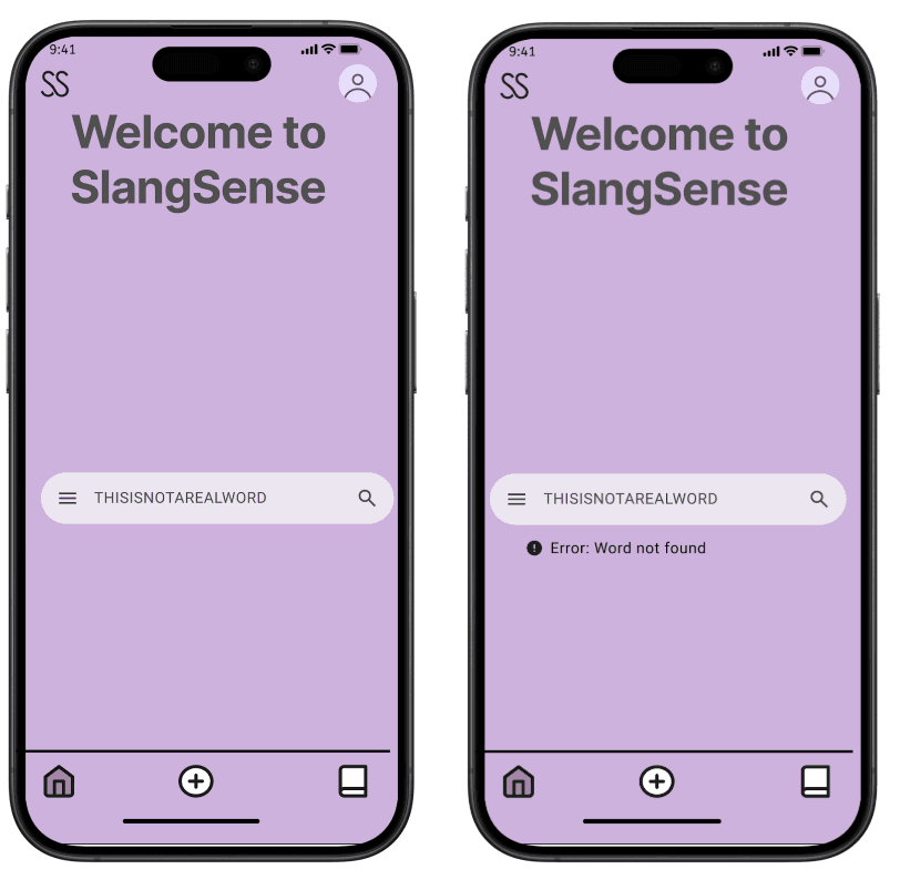
No “undo” if a word is added by mistake.
Inaccurate slang detection may cause confusion, no way to correct it.

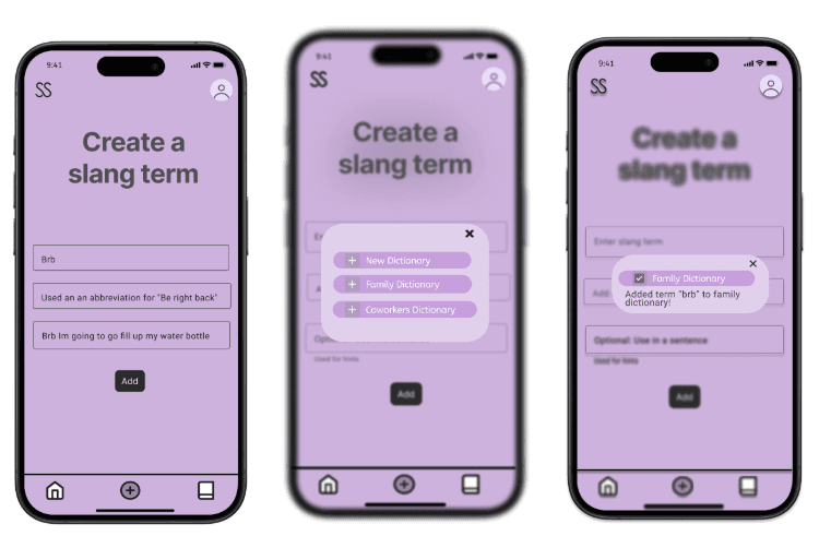
Task 3: Create custom slang term + add to dictionary
Usability Analysis
Learnability (Negative):
Uniform purple theme can make some buttons less noticeable.
No scroll bar on the “Add to Dictionary” popup may limit usability.
Efficiency (Negative):
No autofill suggestions for definitions slows down term creation.
No edit/delete options for created terms reduces flexibility.
Safety — Error Handling (Negative)
No character limit on input fields may lead to formatting or usability issues.

Task 4: Dictionary Creation and Navigation
Usability Analysis
Learnability (Negative)
None identified.
Efficiency (Negative):
None identified.
Safety — Error Handling (Negative)
No warning or prevention for creating dictionaries with duplicate names, which could cause confusion.


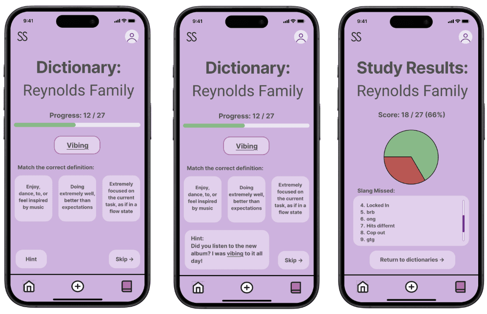
Task 5: View Terms and Learning Feature
Usability Analysis
Learnability (Negative):
No reverse match mode (definition → term), limiting flexibility.
Efficiency (Negative):
Must complete an entire study set to see results, which can be time-consuming for long sets
Safety — Error Handling (Negative):
None apparent.

User Testing
We conducted usability tests on our low-fidelity wireframes with 5 real users. We gave them three tasks to test:
Sync extension to iMessage + navigate
Create custom slang term and add to a dict
View and study a dictionary
Here is a quick recap of our testing notes:
User 1:
Usability Notes:
Sign-in was smooth; user enabled iMessage extension with ease.
User added a new word easily but expected the entire dictionary row to be clickable.
Successfully navigated to the dictionary and used the study panel.
Suggestions:
Highlight iMessage extension setup for older users.
Make the full dictionary row clickable.
Add labels to icons for clearer navigation.
User 2:
Usability Notes:
User logged in easily but took time to locate the iMessage extension in settings.
Successfully tapped a highlighted word, used the pop-up, and added it to the dictionary.
Navigated to the book icon and study mode smoothly.
Suggestions:
Add search to the “Add to Dictionary” feature.
Enable adding slang to SlangDeck directly from iMessage without opening the full pop-up.
Consider swapping settings and home icons for improved navigation.
User 3:
Usability Notes:
User signed up, synced contacts, and assumed future access.
Used iMessage to tap highlighted words and liked the scrollable definitions; expected a reply option.
Understood the create page as a family dictionary and added a term easily.
Accessed study mode, appreciated color feedback, and completed the set.
Suggestions:
UI is clear and colors are helpful, but navigation could be more intuitive for older users.
User 4:
Usability Notes:
Logged in, synced contacts, and enabled iMessage extension smoothly.
Used SlangSense in iMessage and explored definitions easily.
Added a word and tested study mode successfully.
Suggestions:
Emphasize the iMessage extension’s importance during setup.
Add a back button in the quiz for better navigation.


High Fidelity Prototype
This was a really, really fun project! I liked how we chose a problem where we didn't belong in one of the main user groups (elders). This made UX Research a lot more essential in the process and we delved a lot more into the interviews and user testing as a response.